Building on the set of resource management features we rolled out a couple months ago, we have added more flexibility for creating and tracking custom resource statuses. These statuses can be used to visually highlight different stages of your occupied resources in different colors to help make assignment decisions faster and easier.
Here is a new video on resource management, including the new custom statuses:
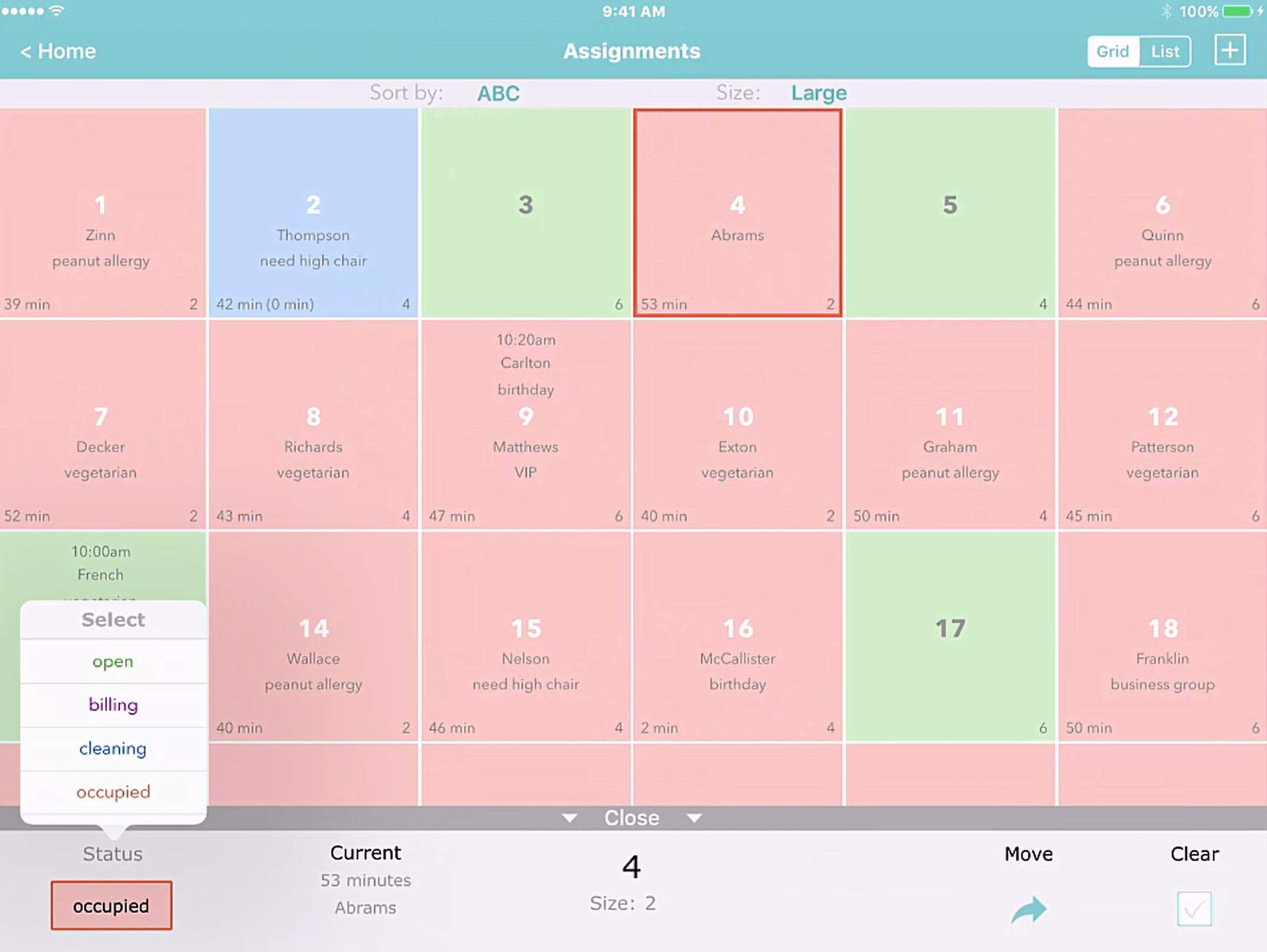
For example, say you are managing restaurant tables and using Waitlist Me to view what tables are available or occupied. You can sort tables by the times they have been occupied for a better sense of which ones will become available first. Now with custom statuses you could improve on those estimates even more by changing the states of tables that are waiting for their bill or being cleaned. Marking tables with customers waiting for their checks as “billing” can give your bus boys a heads up on which tables would need cleaning soon. Similarly, you can change the status of tables to “cleaning” when they are being cleared and prepped. Using more detailed statuses can help your staff at the front of the house know what tables will be available soon, which means they can quote better wait time estimates and seat customers faster. This means more revenue for the restaurant through more table turns and improved customer satisfaction.
This is just one example of how it might work in a restaurant, but the flexibility of the naming and usage of statuses means they can be tailored to different processes in different businesses.
To change a status in Waitlist Me, all you have to do is press on the resource and an action bar will appear at the bottom of the screen. This area shows information on customers currently occupying and waiting for the resource, and has actions for moving and clearing customers. Pressing on the status on the left will bring up a list of statuses, and selecting one will change the status and color of the resource. In the list view, just tap on the status color to change it.

Note that when you choose a custom status you can see both the total time a resource has been occupied as well as the time spent in the current status, which is shown in parenthesis. This makes it easy to see total visit times and times in specific statuses at a glance, so you can tell if a certain stage is causing more delays than others and how that might be affecting total wait times.
Accompanying the custom statuses are a couple of new sorting options in the Grid view, where you can view your resources grouped by Status. Select “Status the ABC” to have all the statuses grouped together and then ordered alphabetically by the resource name or “Status then Time” to have them ordered by the length of time they have been in that particular status.
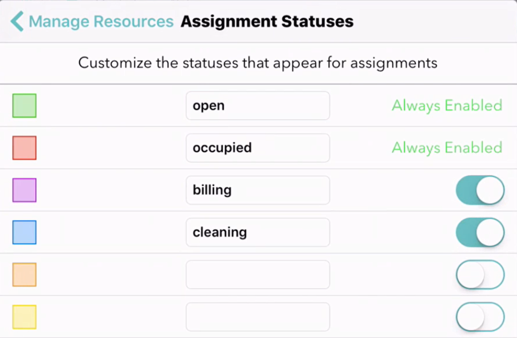
To customize your statuses, go to your Settings and then press on “Manage Resources” and then again on the “Statuses” in the upper right. In addition to the default “available” (green) and “occupied” (red) statuses, you can add four of your own statuses. Just add the names and move the sliders on the right to turn them on or off. Statuses will show alphabetically in the options when you select them, so you can set the naming accordingly. The green and red statuses for available and occupied resources are always required, and custom statuses are treated as states of an occupied resource.
